
Yeti’s logo is simple: just its name written in an all-caps sans-serif font, placed within a rounded rectangle. But to speak to new consumers, they’re getting rid of the one element that gives it brand recognition.
In a new campaign created in collaboration with Wieden+Kennedy Portland, Yeti deleted the “Yeti” in its logo to make room for other four-letter words, like “Hike,” “Surf,” Golf,” “Fish,” “Hunt,” and “Snow.” They’re all written in the Yeti brand font, which closely resembles the bold grotesque sans serif Archivo Black.
For the company, which was founded in 2006 and marks its 20th anniversary this year, it’s about broadening its reach. The word variations associate the cooler maker with more than just making coolers—which makes sense, considering the fact that Yeti also sells bags, drinkware, kitchen items, dog gear, and apparel.
The campaign is set to go up across digital and out-of-home advertising in big cities like New York and Los Angeles, and at sporting events including the FIFA World Cup 2026, PGA Championship, and NCAA Division 1 Women’s Lacrosse Championship. There, mobile billboards will use four-letter words specific to each event.
Yeti Holdings said in its February earnings call that its net sales had risen 5% year over year, driven by growth in areas like drink wear and international sales. It’s also doubling down on bags.
It’s a period of expansion for the company—and so for the first time, Yeti sought outside creative help. The company released its first-ever ad with an outside agency, also with Wieden+Kennedy, last year. Its newest ad, “Four Letters,” gives the brand the urgency of a Nike or Gatorade commercial.
It’s also meant to help the company achieve its goal of reaching young consumers, women, parents, and sports participants and enthusiasts, Yeti says. The new campaign gives the brand the flexibility to tailor its outreach to each target group’s interests by turning its logo into a customizable badge.
It’s clever in theory, but in practice the campaign also highlights the limitations of an under-branded, minimalist logo. While Yeti’s no-frills logo looks simple and great on coolers and water bottles, it’s not quite distinct or strong enough to stand on its own for viewers who aren’t already fans.
For many of the new consumers Yeti is hoping to reach, words like “Wild” or “Dirt” written in black and white in an all-caps sans-serif inside a rectangle won’t immediately conjure the Yeti brand in their minds alone.
This isn’t like Burger King, which has a unique enough combination of colors, fonts, and shapes in its logo that it’s still recognizable even when the brand name is removed.
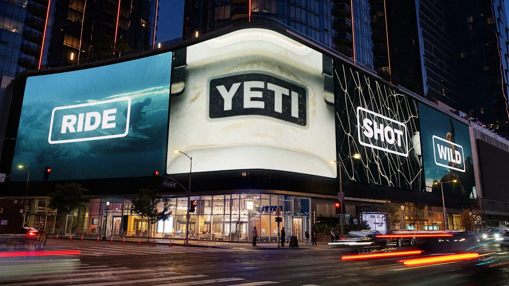
The campaign works best, then, in assets that give viewers additional visual context. That could be a graphic of a well-worn cooler that has the original Yeti badge in place, with stickers depicting the other words stuck haphazardly across its surface, or images that show a new four-letter word on a cooler badge. By giving the otherwise bland typography a sense of place, it would also give it a sense of brand.
Yeti once delivered limited branded ball caps in every order of the first coolers it sold, putting its logo out into the world through its earliest customers and fans. To expand its reach, it’s instead letting the logomark serve as a blank slate.